Understanding Units in Web Design
A Brief Guide To Web Design Units
Introduction - Understanding Units in Web Design
Web design is a dynamic field that demands a keen understanding of various elements, including layout, typography, colors, and user experience. One crucial aspect often overlooked by beginners is the use of units. Units play a pivotal role in defining the size, spacing, and positioning of elements on a webpage. In this article, we will explore the commonly used units in web design and how they contribute to creating visually appealing and functional websites.
1. Pixels:
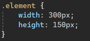
Pixels are the most basic unit in web design and are widely used to define the size of elements on a webpage. A pixel is a single dot on a screen, and using pixels provides a fixed measurement that remains consistent across different devices. While pixels offer precise control over layout and dimensions, it's essential to consider their responsiveness on various screen sizes.
2. Percentages (%):
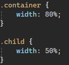
Percentages are a relative unit commonly used for responsive web design. When defining dimensions or spacing in percentages, they are calculated relative to the parent container's size. This allows for fluid layouts that adapt to different screen sizes and resolutions.
3. em and rem:
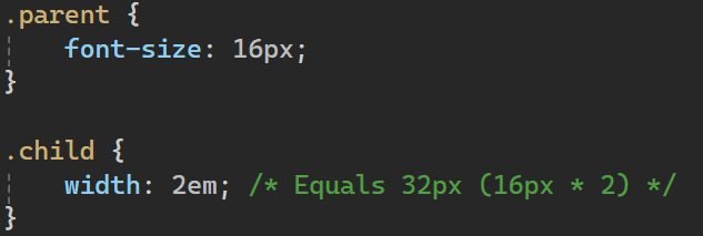
The 'em' unit is relative to the font-size of its nearest parent or the element itself. This makes it particularly useful for defining dimensions in relation to text size, providing scalability in responsive designs.
The 'rem' (root em) unit is similar to 'em' but is always relative to the root element's font size, offering a consistent baseline across the entire webpage.
4. Viewport units:
Viewport units are relative to the size of the browser window, providing a responsive approach to design. There are four main viewport units:
- vw (viewport width)
- vh (viewport height)
- vmin (minimum of viewport width or height)
- vmax (maximum of viewport width or height)

5. Grid units:
With the advent of CSS Grid, a new unit called the 'fr' (fractional unit) was introduced. It represents a fraction of the available space in the grid container and is useful for creating flexible and responsive layouts.

Conclusion:

Understanding and effectively using units in web design is crucial for creating websites that are not only visually appealing but also responsive across different devices. Whether you opt for pixels, percentages, em, rem, viewport units, or grid units, each has its unique advantages and use cases. By mastering the art of unit selection and application, web designers can create flexible and adaptable layouts that enhance the overall user experience on the ever-evolving landscape of the internet.

